This post continues our series on App Home design and best practices for UX in Slack apps.
The first post, focused on navigation, can be found here.
Having awesome features in your Slack app is a great start, but unfortunately it takes more than useful tools to retain users. This post will explore some tried and true methods to improve user experience and increase engagement. These ideas are simple to implement and great candidates for quick experiments within your app or with Block Kit Builder.
Onboarding
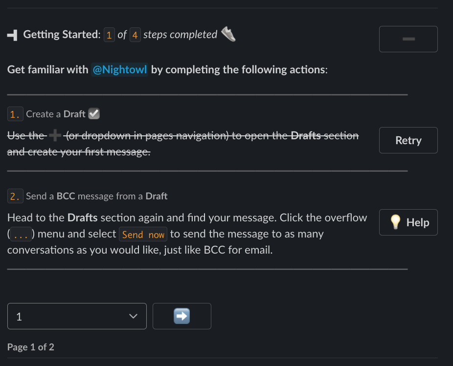
Don’t leave users stranded the first time they open the app – without the proper introduction there’s a good chance they may never return. Onboarding is often the only opportunity to show users the value of your app and how best to use it. The more complicated the app, the more critical it is to help users get started. Proper onboarding should reduce friction immediately and in the future. Even a small introduction can make a world of difference. Check out this article if you’d like to dive deeper into advanced onboarding designs.

User Settings
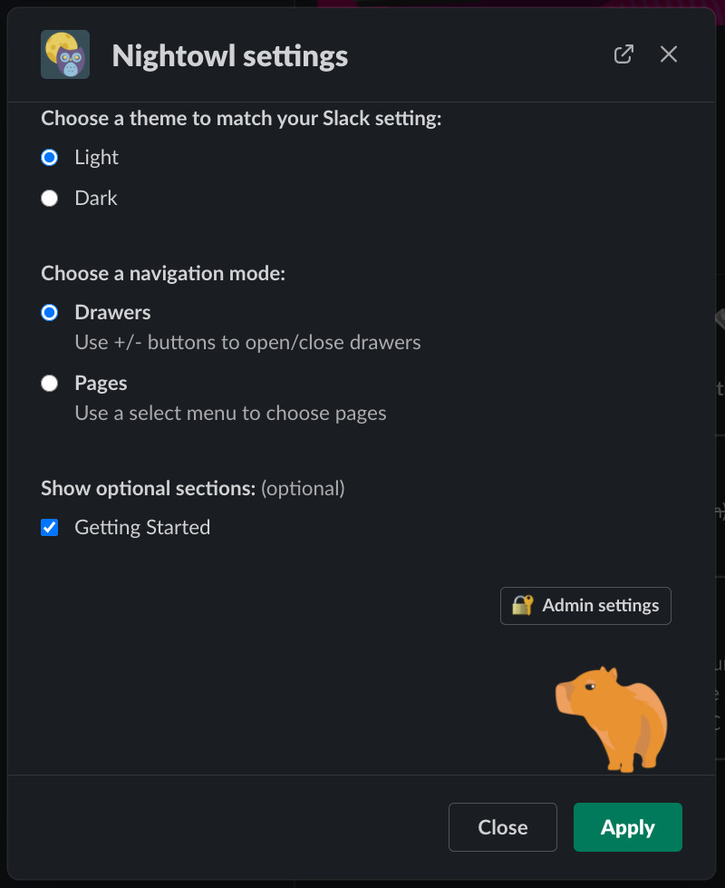
Getting users to invest energy into your app is one way to increase retention. If you’ve spent time creating new items or customizing a new app, there’s now friction making it harder to abandon. It’s a sunk cost, people hate to lose work they’ve already put in, but it can be put to good use for engagement. Customization also gives gives users a feeling of control and increases the chances they will share their experience with others.

Gamification
Points, badges, and progress meters can be used to coax users into exploring the features of your app and encourage ongoing engagement. Humans love to boost their scores or complete all the steps of an assignmen, so harness some of that energy to increase their activity in your app. Check out Userlane’s guide on gamification in SaaS for inspiration.

Contagious Experiences
Get creative thinking of ways your users can spread the word and put your app in front of others. Take Grow for example: each time someone uses the app and reviews another user, they pull that person into the App Home to find out what this message is about. Note that in this case, the colleague is doing your bidding, which is very different than a message from a bot. Following Grow’s approach, seek out spots in your app where it makes sense to message others on a user’s behalf.

We hope that you’ve found some inspiration in these concepts for boosting user engagement with your Slack app. A few small tweaks can significantly alter the UX and make it more enticing for users to spend time in your app and share it within their workspace and beyond. To learn more about what’s possible in Slack’s App Home, check out their docs.
Interested in seeing user engagement done right?
Check out Happybara.io, our Slack apps push the limits of functionality and user-interfaces (they’re also free to install and use).
To learn more about using and building Slack Apps, subscribe to our mailing list or give us a follow on Medium or Twitter.
