
This is the first post in a new series that will walk through App Home design and best practices for Slack apps, step by step.
When designing a Slack app, you should strive to deliver an intuitive user experience. Slack’s App Home makes it easier than ever to create high-quality user interfaces by borrowing familiar elements from the web.
For a good experience, users need to be able to navigate smoothly throughout your app. If they can't get to the important feature you just added without getting frustrated, it wasn’t worth building. Let’s take a look at some of the common patterns for navigation and how to apply them to Slack. These design elements reveal only a single area of content at a time, simplifying the user journey in your app. To demonstrate each style of navigation, we will start with a template provided by Slack and then modify it. Each section will have a Block Kit Builder link so you can try it out yourself. Let's go!
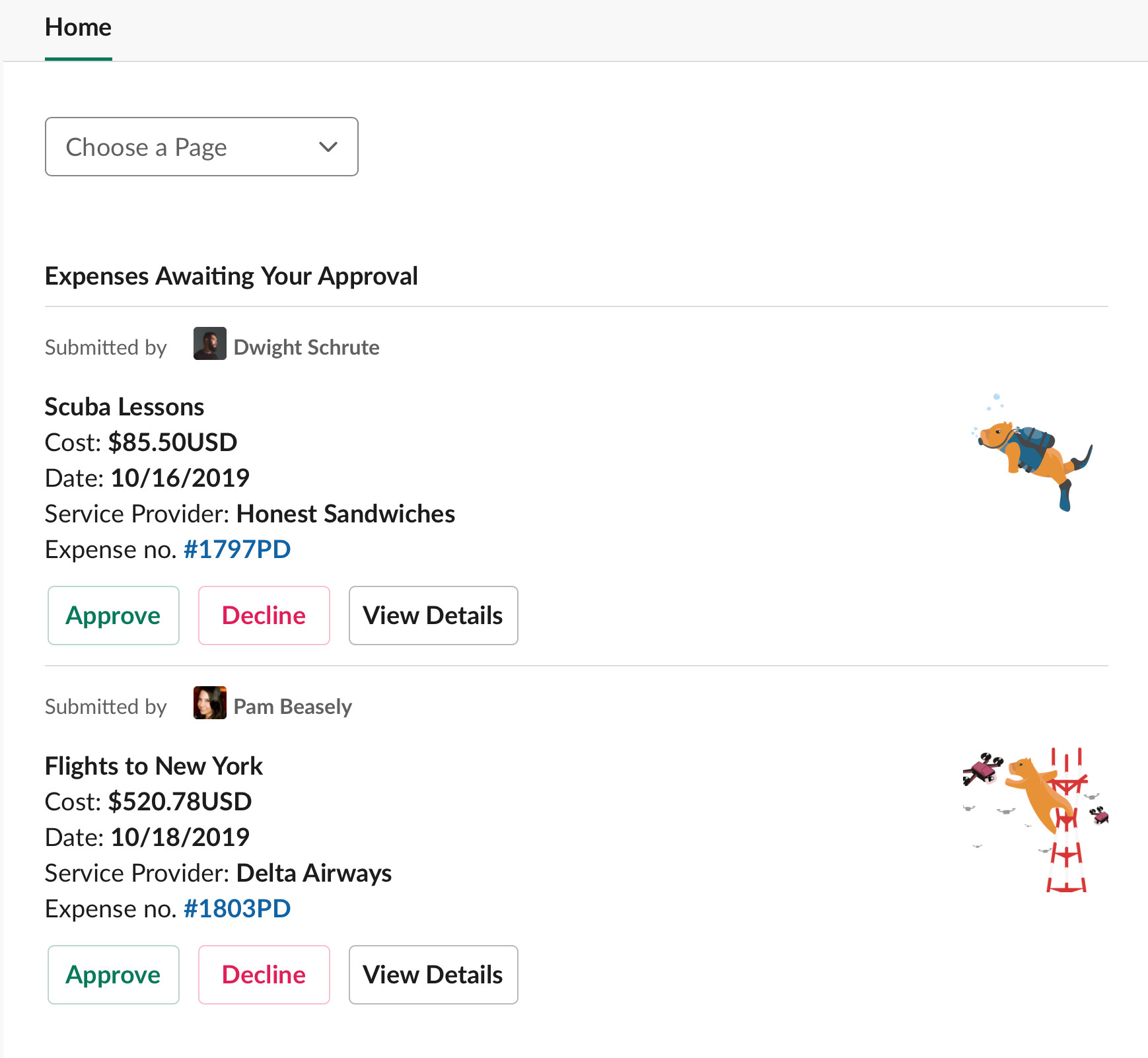
Paging
Dropdowns are a common utility, and this idea should feel similar to the burger menu popularized by Facebook. Implement paging with either a select menu, so you can customize the placeholder text and have more than five options, or an overflow menu.
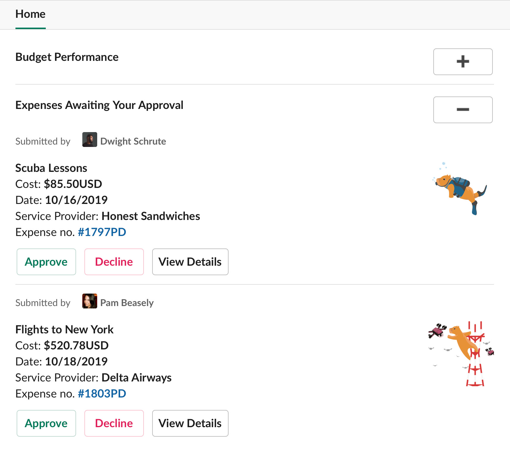
Accordion/Collapsible Sections
A classic pattern that makes information accessible without overwhelming users. Everything stays hidden unless the user chooses to dive deeper into a section.
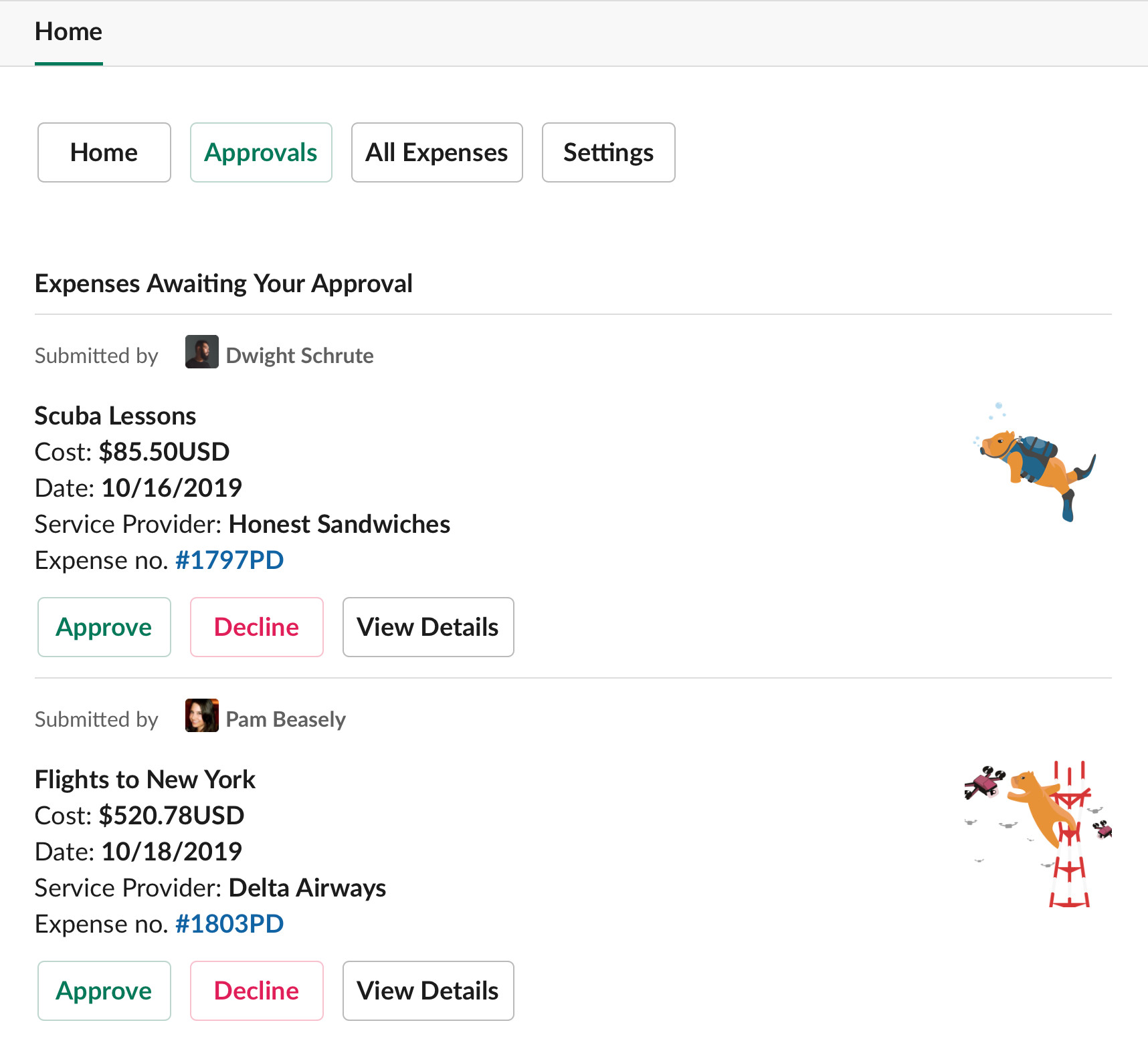
Tab (Button) Navigation
Often seen in mobile apps, tab navigation can be accomplished with buttons in App Home. This style is good for apps that only have a small number of sections as too many buttons (tabs) can appear unwieldy. A possible workaround would be combining tabs with the next idea, modal navigation. Limit your tabs to just the most crucial, then make a 'More Options' tab to show all sections in a modal. Another alternative is to use buttons for the top sections and an overflow menu for those that remain.
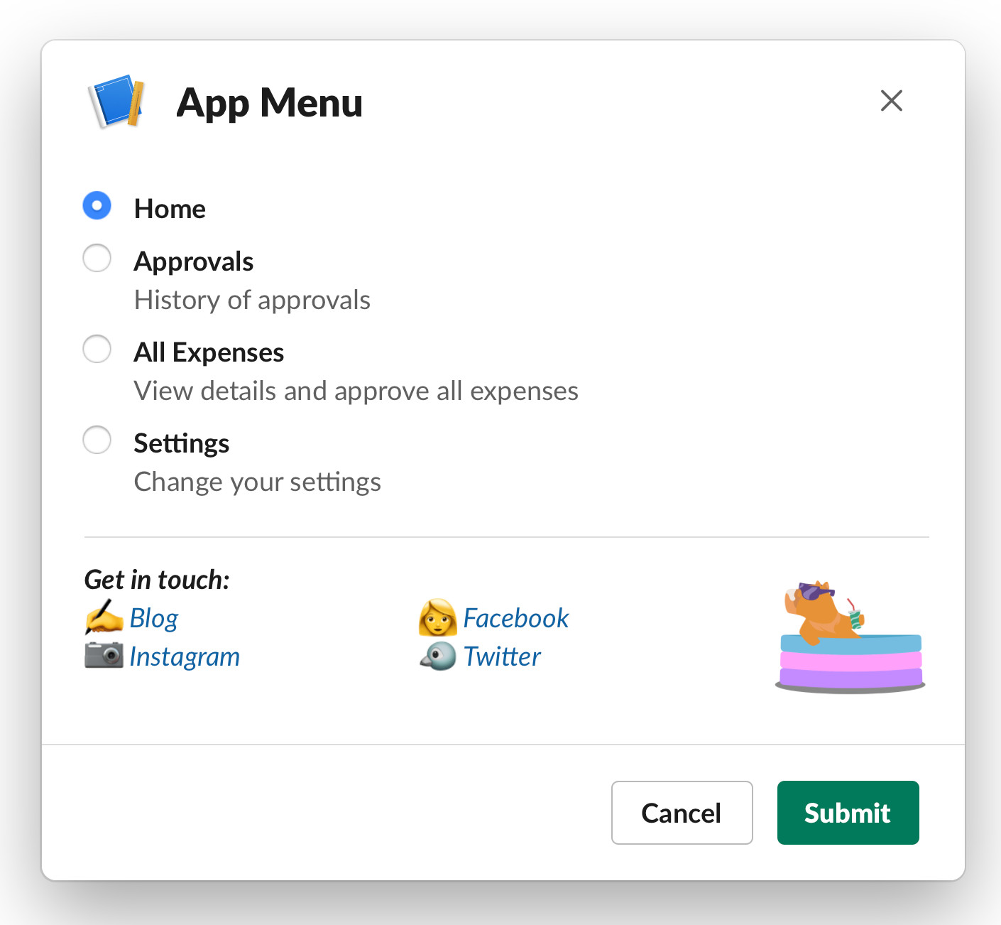
Modal Navigation
To approximate drawer navigation from the web, pop a modal from a button. Drawers let the user focus on choosing where they want to go without any distracting content. There is also room here to gain extra value by adding your branding and contact information. Give this article a quick read if you'd like to learn more about how drawers can be intuitive for users.
Navigation brings your users to all the actions that make them fall in love with your product. Take the time to ensure they aren’t stopped by bad UX before they get there. These ideas are a small sampling of web patterns made possible by Slack’s App Home. If you'd like to learn more about what’s possible in Slack’s App Home, check out their docs.
Interested in seeing App Home navigation done right?
Check out Happybara.io, our Slack apps push the limits of functionality and user-interfaces (they’re also free to install and use).
To learn more about using and building Slack Apps, subscribe to our mailing list or give us a follow on Medium or Twitter.